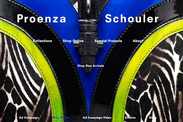
Proenza Schouler, the luxury womenswear brand has undertaken an elaborate rebranding exercise, under the direction of art director Peter Miles, in order to connect better with its customer base and enlarge it. A major step in that direction is the redesigning of their website. Jack McCollough and Lazaro Hernandez, the designers of the brand are betting heavily on the digital culture and hence have revamped the site completely. Their eCommerce contributes 15% of their overall business which is more than the sales of any of their stores. This is a significant portion of the business with potential to grow fast and needs looking after and careful planning. The revamped site will stock a range of small leather goods including handbags as well as scarves, jewelry and select items from the Spring 2013 runway collection.
Proenza Schouler Site Available in European and Asian Languages
The investors in Proenza Schouler including American fashion mogul Andrew Rosen, CEO of Theory and Helmut Lang are very optimistic about the label and the global potential of eCommerce. The site is to be translated into many of the European and Asian languages. For an emerging designer label Proenza have been very active in the social media space and has over 270,000 followers on twitter. It is the result of their GIF-based Twitter campaigns conceived with Internet artist Jeanette Hayes. The fact that they have won the CFDA Womens wear Designer of the Year award twice has also helped. Hernandez, one of the ‘Proenza Boys’ as they are known in the industry, points out that they have grown up with the internet and look at it as the best way to connect to family and friends.

Proenza Does Not Lean on Nostalgia to Create a Sense of Luxury style
Hernandez and McCollough have always had a positive approach towards digital marketing. They attended blogger’s conferences and live streamed their runway shows. This not only helped them connect to their customer base but enlarged it. They listen to their followers and tailor the content accordingly. It has given them a messy often goofy image on the internet. It is in direct contrast to other digital savvy megabrands Burberry and Net-a-Porter who are firmly rooted to the glossy and polished legacy of print media. Proenza, unlike other luxury brands doesn’t like to lean on nostalgia to create the feeling of luxury. They have positioned themselves as a contemporary brand and their content is always tailored to gell with the modern internet culture.
The New Site is Easy to Navigate and Has Visually Rich Imagery
Presently their new site provides only basic links of sharing between key social platforms. But it is bound to evolve in the future as they continue to generate significant social conversation. The new website is a mix of basic type and boasts of visually rich imagery. It is user friendly and easy to navigate. The layout is accessible and the quick zoom helps you select what you want. They have not taken the traditional route but have dared to be different. McCollough says confidently, “It’s not your mom’s luxury brand.†They are consciously trying to position themselves as the next generation luxury brand and have whole heartedly embraced the culture of internet. They are confident of driving growth online and they are most likely to succeed.


